The new brand orientation was developed by means of a workshop: DOMUS is committed to its roots and classics and shows its continuous development. The company is fully aware of its core theme: products that serve the human being are created from the passion for light. In addition, the years of experience and special skills underline the professional competence of DOMUS in a special way.
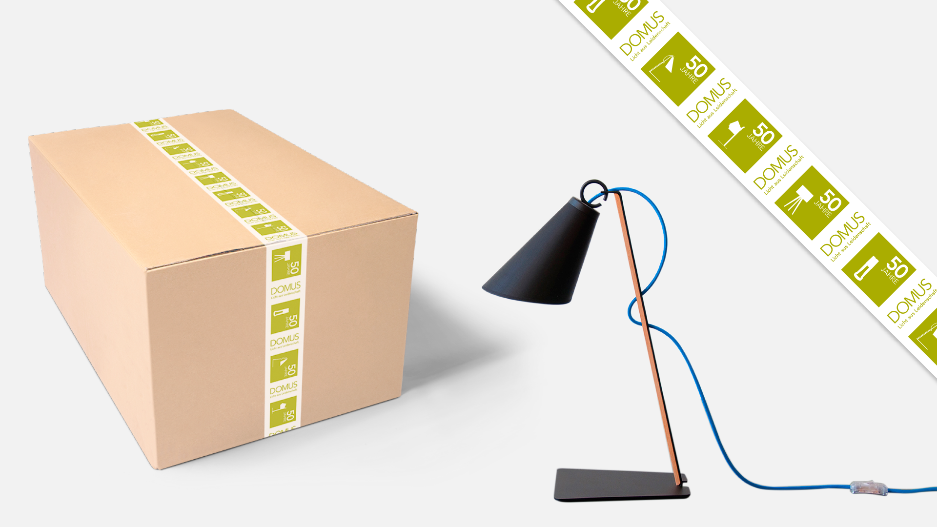
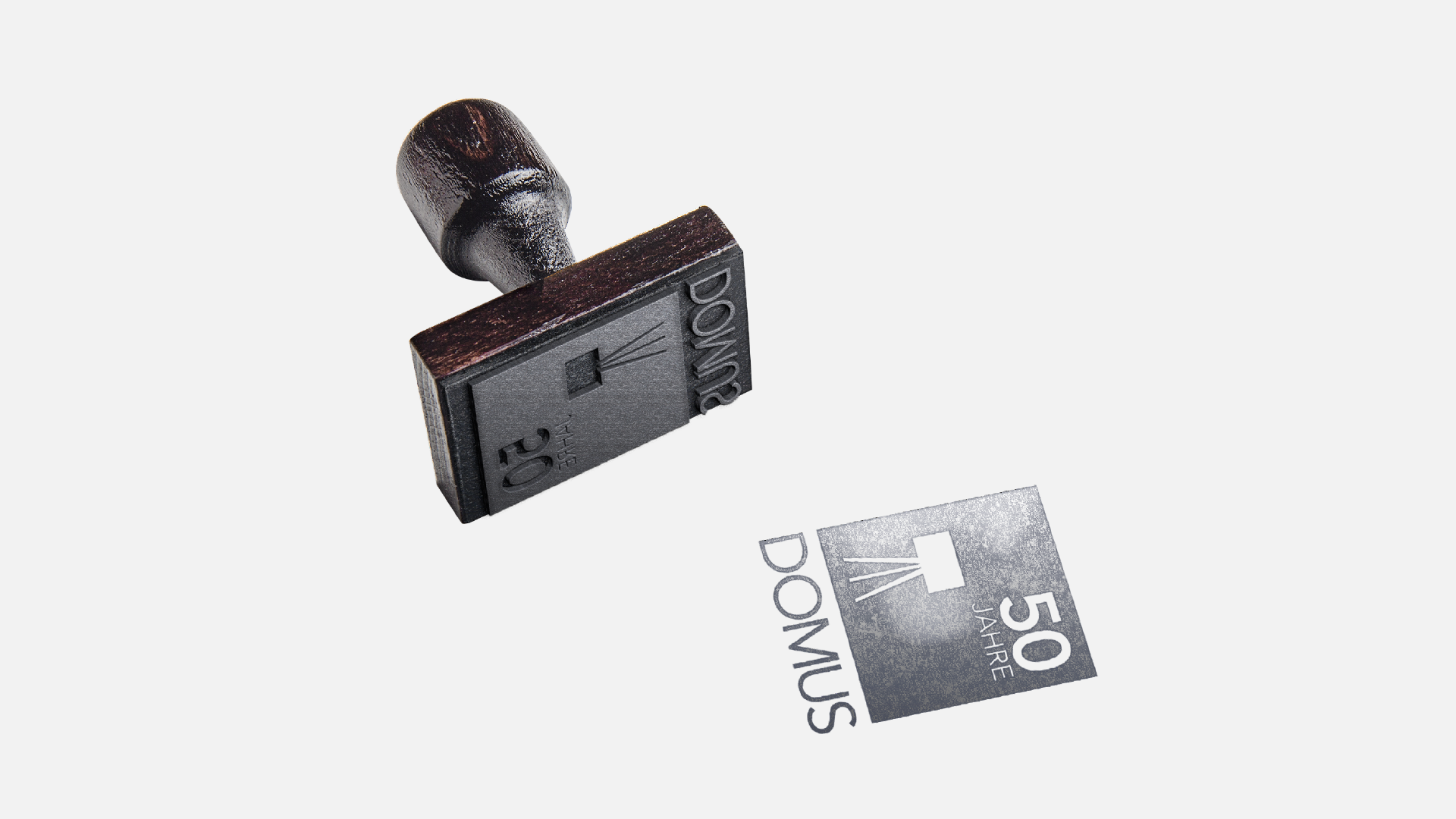
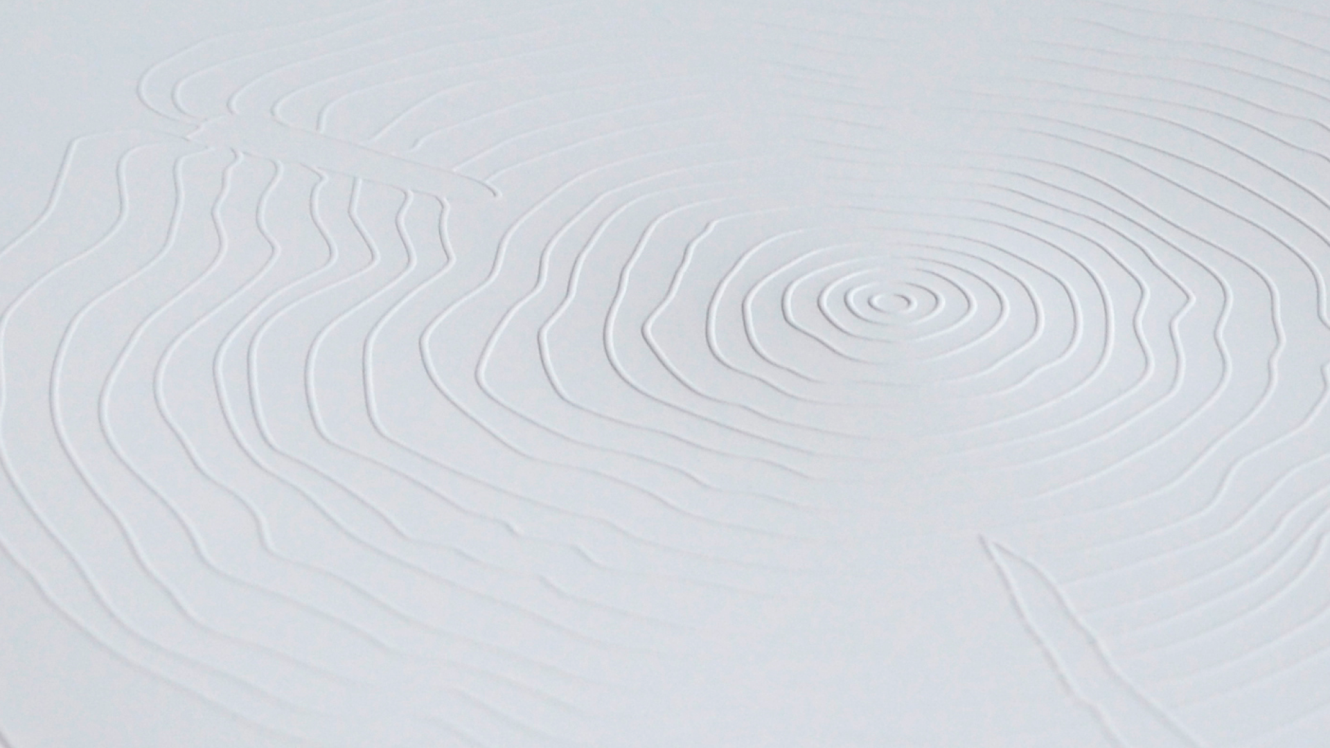
The solution, as the special experience and further development of DOMUS is presented, is simple: every lamp is communicated with the year in which it was created. The year is displayed like a label with the luminaire. As a symbol for the development of the lamps since 1966, the annual rings of a tree trunk have been chosen. The tree trunk simultaneously represents the connection of DOMUS with the material wood. The core of the brand is visually transported in media such as the annual catalog and the website. For example, the luminaires are represented by an atmospheric and an informative part.
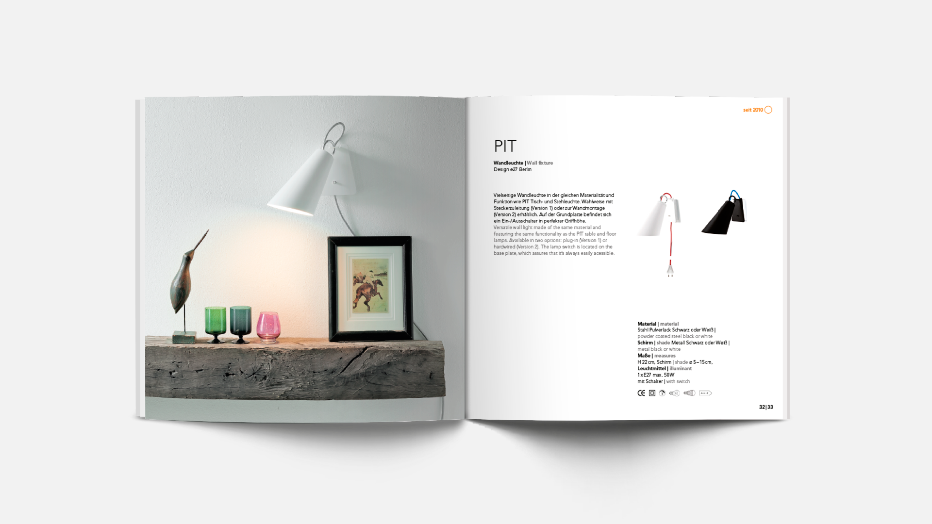
In the catalog, the image of the tree rings is a guide, and can be used as a haptic experience as well as an interactive information graphics. e27 accompanied the product reorientation of DOMUS with the PIT lamp. Simple and refined at the same time, the luminaire can be adjusted in two axes by means of its joint in the form of a ring in a stepless manner and precisely aligned. Thus, PIT comes without complicated mechanics. The textile cable of the luminaire is pulled through the luminaire foot and unites playfully design and functionality.