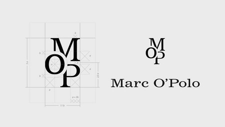
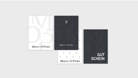
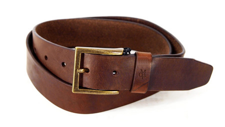
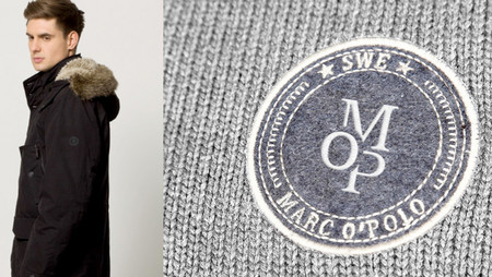
e27 developed a symbol which convinces through its simplicity by playing with the letters M, O and P. It is a compact and brief symbol which can be integrated easily in the existing corporate design of the company. We worked out all conceivable options for its application to demonstrate its universality: it can be scaled, embroidered, printed and performs on products, textiles, printed matter and in the signage. The company liked it, took it and implemented it. We are proud to see our work on millions of clothes all over the world.